Roles:
Technology:
Brief
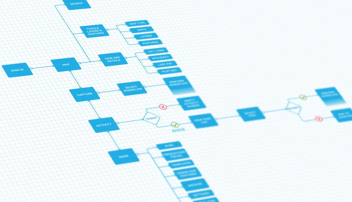
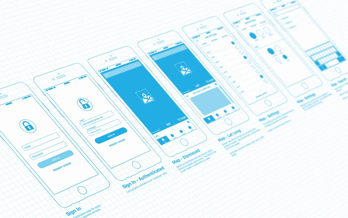
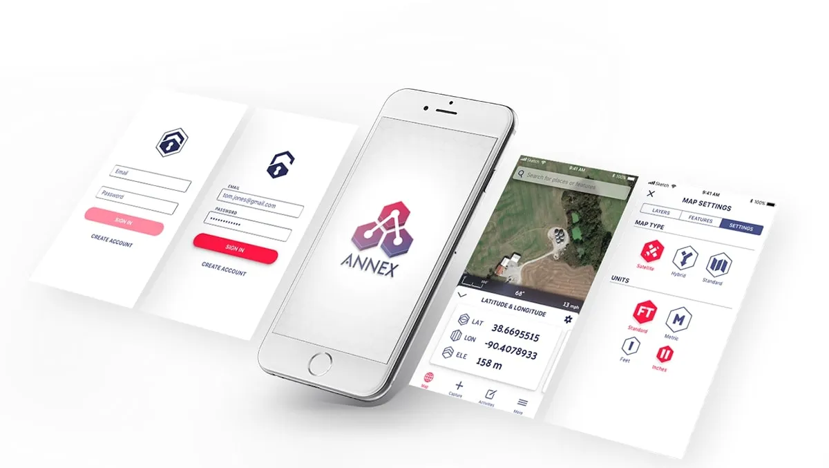
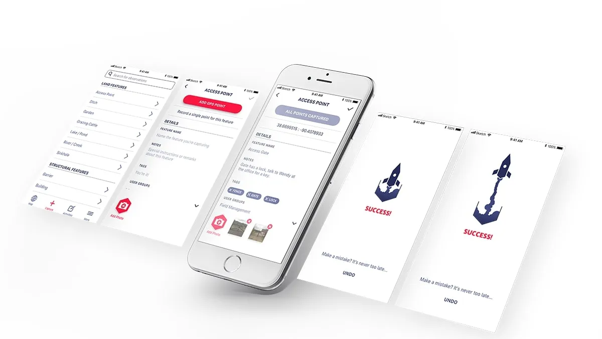
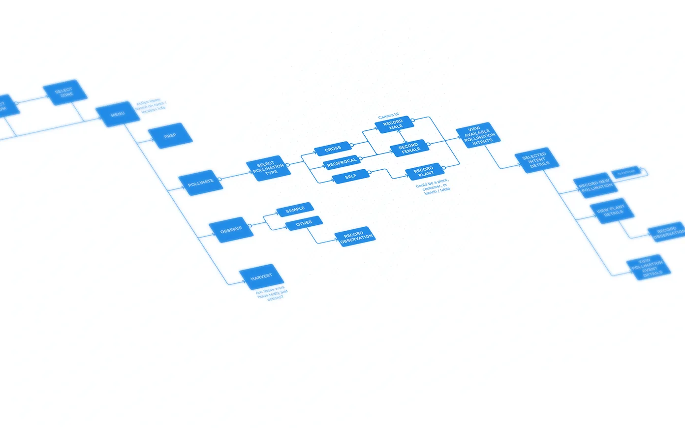
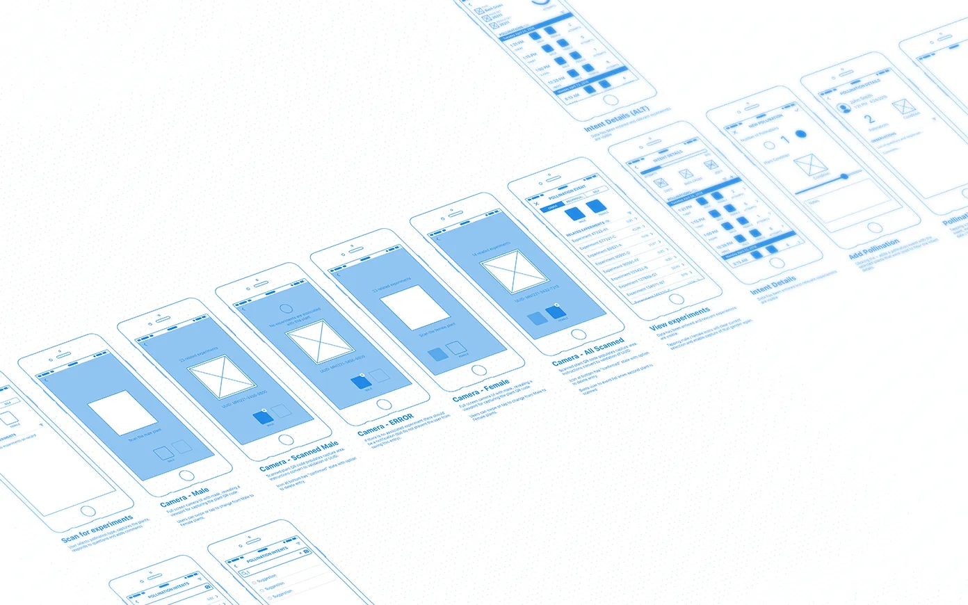
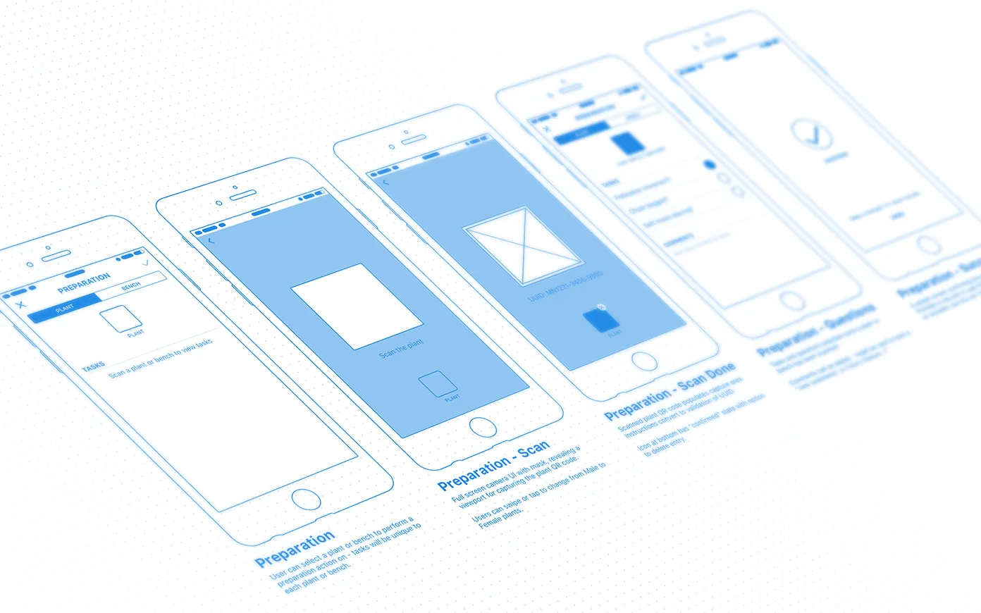
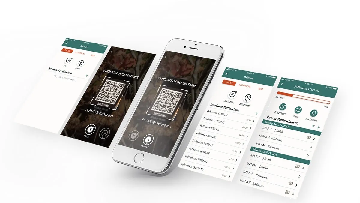
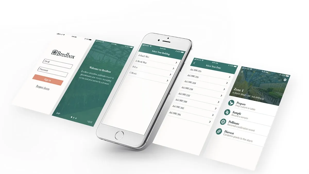
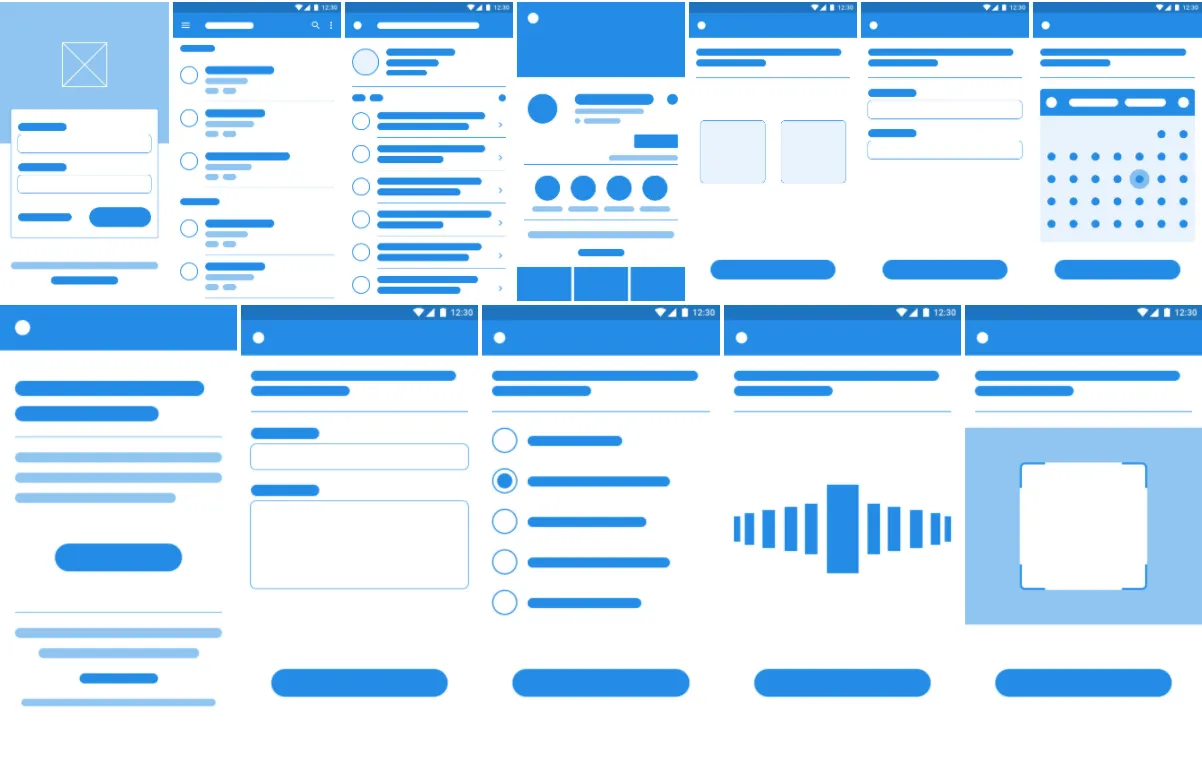
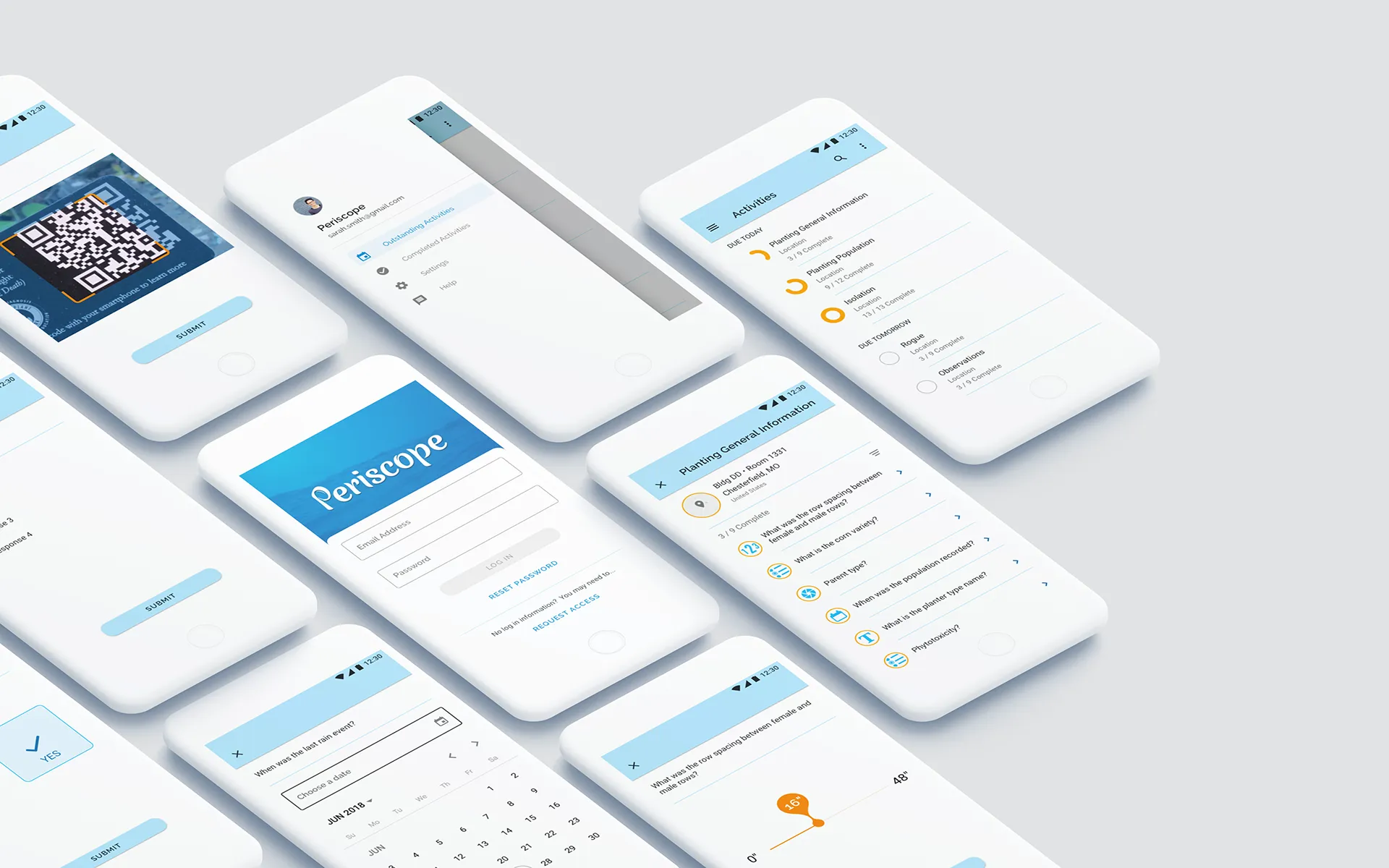
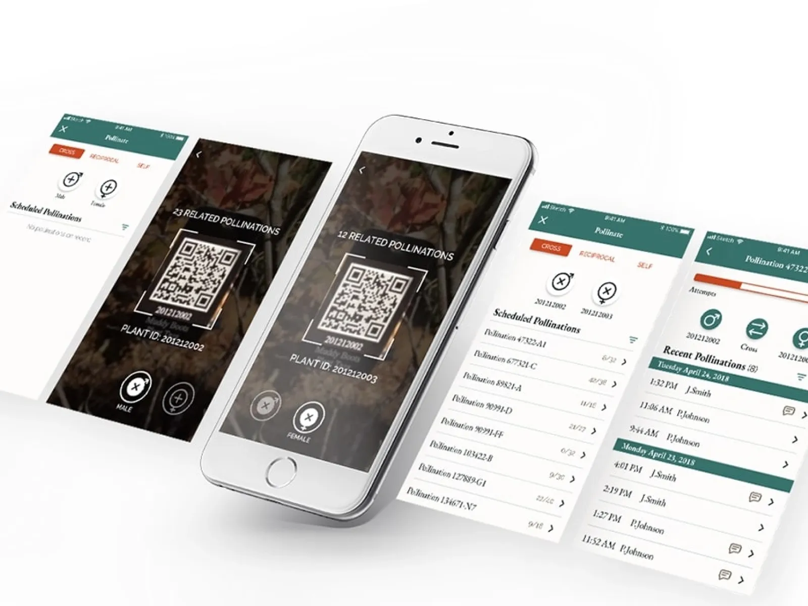
These are some white-labeled samples from a few of my favorite projects during my contractor days at Monsanto.
Strategy
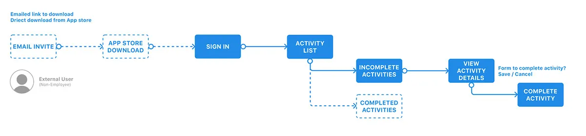
For each engagement I would do some user research, meet with product teams, and seek to understand the project goal. Then I’d work in Sketch to deliver whatever assets were necessary to keep development headed in the right direction. I would set up user testing sessions to driver product iterations, as well.
Challenges
Monsanto operated as a federated design team, designers were not assigned to products but offered as temporary helpers. I’m a product guy at heart and I found it difficult to be temporarily engaged with a team and build relationships then move on to the next job.
Outcomes
I worked on 3 different projects, 2 early-phase and one existing. However, I was never engaged long enough to see an apps released.